Instructor CMS Image Library
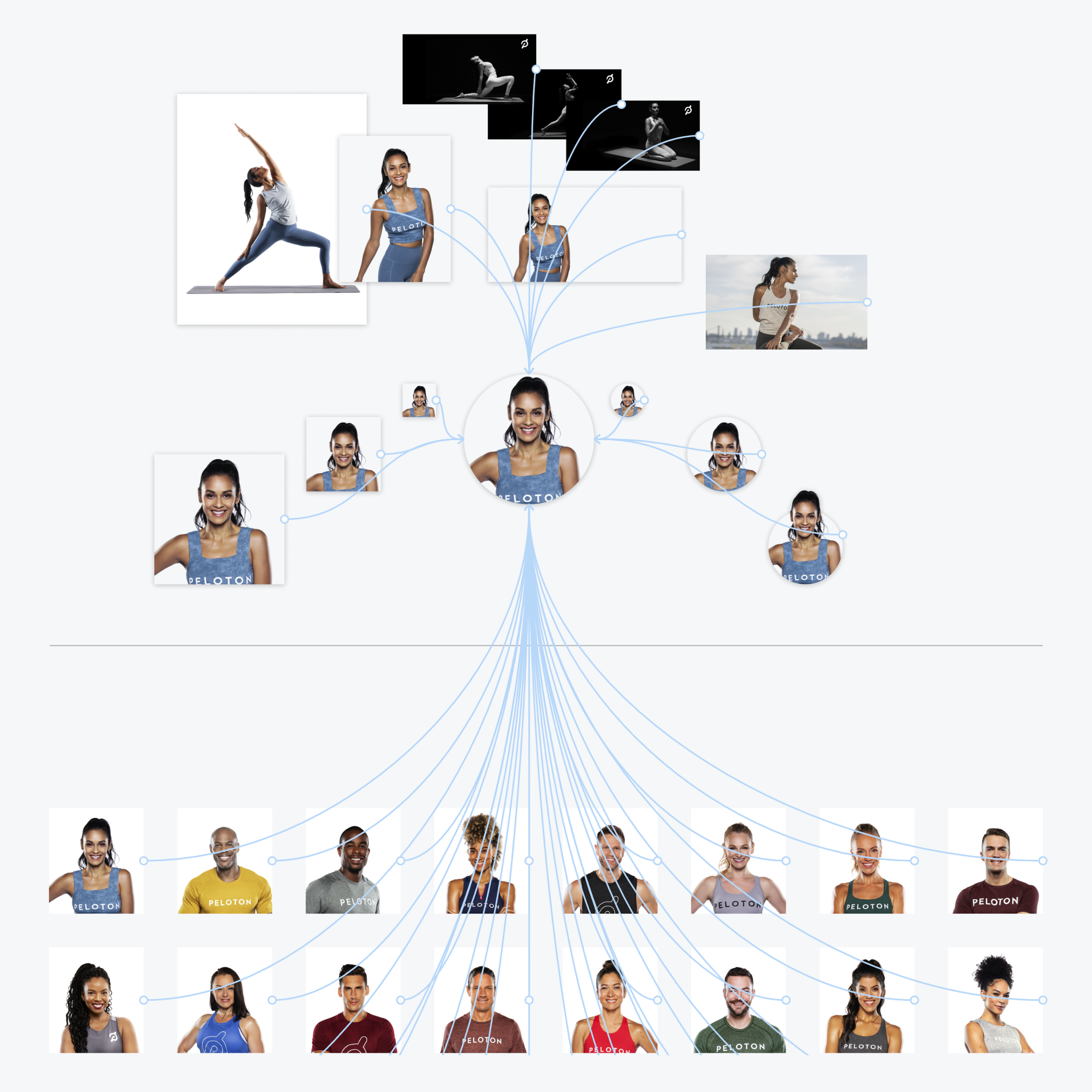
Peloton’s CMS requires various specific photo assets of each instructor to work across several touchpoints on various product platforms. I helped produce image component libraries using Figma and related each of those image library sets to a master component library that followed our spec requirements so that designers across Creative and Product teams could leverage core instructor image components in their designs.
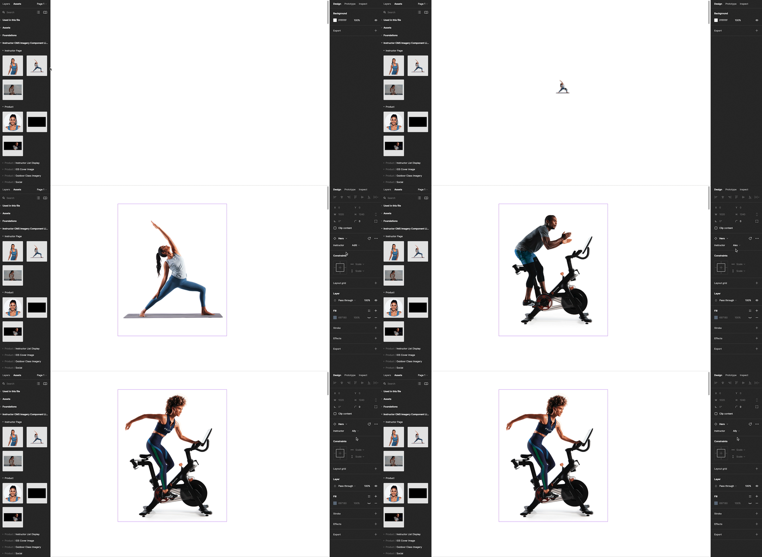
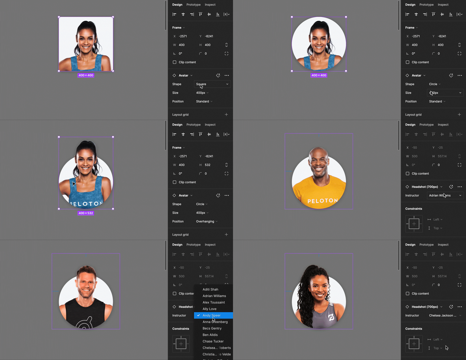
Each component in the library wasn’t just built as a placeholder design element, but acted as a live component linking directly to one of four different instructor imagery libraries and allowing the designer to select whichever Peloton instructor they wanted in their designs. This helped significantly reduce time searching for and replacing imagery, and also ensured designers were always using the most up-to-date photography (and doing so in a consistent way).
Whenever new photography became available, the image libraries could be updated and all changes would push to the main components for all designers using Figma across the organization.
Financing Lockup Component Library
In addition to our instructor imagery libraries, we also created libraries of commonly used, but difficult to edit design elements. A key example of this was Peloton’s financing pricing. Because financing differed between products, currencies, and regions (which had different legal language requirements as well), I produced a lockup that all designers could use as a reusable element and could simply select the correct region, product, and color-way for their designs. This lockup appeared in a consistent way across all materials from digital, to video, to print.
When pricing changed or terms changed, we could easily update the corresponding master component and push the changes live to all designers at the company.


